SMITTEN, the international design communication firm grown out of India that created the new identity for the Indian Olympic Association (IOA) along with the International Olympic Committee. Working in alignment with the #VocalforLocal sentiment, Smitten has built a brand identity that celebrates the contribution of all the athletes in building up such a glorious Indian Team over the years.
Commemorating the 100th year of participating in the Olympics, the IOA adopted a new branding and visual identity. SMITTEN rightly identified this opportunity to celebrate this exemplary milestone in the history of IOA and Indian sports, representing India on global platforms with a new proud identity.
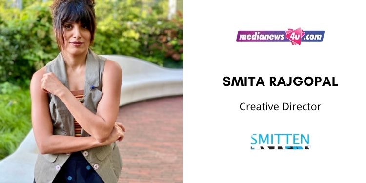
Smita Rajgopal, Creative Director at SMITTEN, on the IOA logo, challenges as a women CEO and much more…….
SMITTEN’s journey, an overview?
We started out as a one-woman team in Madras, and have grown into a lean team of strong creative professionals SMITTEN, the international design communication firm grown out of India that created the new identity for the Indian Olympic Association (IOA) along with the International Olympic Committee. Working in alignment with the #VocalforLocal sentiment, Smitten has built a brand identity that celebrates the contribution of all the athletes in building up such a glorious Indian Team over the years.
In this regard, I would like to propose an interaction with Marking the 74th Independence Day, Smita, the woman behind the team that created a new identity for IOA and Team India, would love to share the story behind it and the work gone into creating such a proud milestone for our country.
What made you create this new identity for IOA now?
When we began expanding across geographies, we developed a sort of pet peeve toward the aesthetic that’s commonly associated with India. Despite the varied cultures and their nuances, Indian identities are reduced to a specific typeface style, an elephant or a palanquin, that is fussy and overly ornate. We knew we wanted to appeal to young India – whose support athletes and sports people seek in their careers and the diaspora across the globe. And we knew the identity had to be slick and sporty.
With that in mind, we began considering various cultural elements that are both sports-neutral as well as region-neutral. And the irrefutable truth was that in a country with so many different cultures, it was the tiranga, our flag, that unites us at any stadium or national event. That one uniting element held by both athletes and fans in pride and passion at sports stadiums. So the logo had to capture that.
We also believed that it was time for the Indian identity to be synonymous with the flag colours, in much the same way as a Team GB or Team USA immediately helps you picture their colours of red, white and blue.
We wanted to create an identity that could stand the test of time, and truly be representative of the nation in the world arena.
How will this new identity align with the PM’s call #VocalforLocal?
We believe that the IOA’s decision to choose a homegrown agency in itself speaks volumes towards choosing local. India can embrace it’s modern values while supporting local talent and economy, and this project embodies this philosophy perfectly.
Can you take us through the idea and strategy behind this new campaign?
We wanted to create an identity that integrated the tiranga with INDIA, inserting it into the letters of the name in a subtle and effortless way. We did this by playing with the negative space available within the I and N while representing the tricolour. The negative space between I and N was to also stand for 1 for unity. Thus we played up this concept of unity, with the launch campaign “Ek India Team India” to communicate that we play as one, no matter the sport, while in the world arena. The idea was to come up with a campaign that could work as a unique hashtag while fans rally behind Team India during sporting events. And the concept of unity which is highlighted in the campaign line allows for extension into a timeless tagline as well – reminding us of the unity in diversity that is so unique about India.

How was the launch planned as this pandemic has seen a huge spike in Digital viewing and also Television viewing?
The spirit of sport is best enjoyed in person, and we were to launch at a live event on August 15th before Team India was to embark on their journey to the Tokyo Olympics. The pandemic has been a curveball across industries, and especially so for our athletes and sportspersons who have had to find new ways to train and practice.
The IOA ensured that these celebrations would still continue with a digital launch which we supported with a strong film that captured the IOA’s journey across hundred-odd years, and which wasn’t about to halt due to the pandemic.
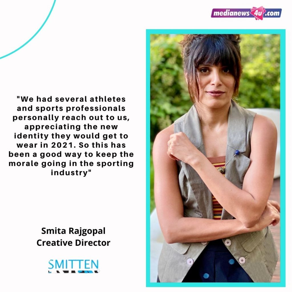
We had several athletes and sports professionals personally reach out to us, appreciating the new identity they would get to wear in 2021. So this has been a good way to keep the morale going in the sporting industry.
We also believe that this campaign was conceptualised by an all-women team, any specific reason?
Our team has a female majority, and it just so happens that the team which conceptualized this identity was entirely conceptualised by women. It was never a conscious decision, but it does remain an anomaly in our industry. There’s also often a certain “aesthetic” that’s associated with female designers, and we are happy to be breaking this stereotype with an identity that is gender-neutral.

Your association with IOA?
It was a true honour working with Dr. Narinder Dhruv Batra, President, Rajeev Mehta, Secretary General, and the entire team at IOA! From the very beginning of the project until the end, their commitment toward empowering the athlete that represents the country has been very evident. We shared in the vision that this identity would commemorate the organization’s dedication to the future of Indian sport.
Dr. Narinder Dhruv Batra, President, IOA says, “What I particularly like about the Indian Olympic Association’s new identity is the story behind the logo. It captures the essence of the tiranga and tells a powerful story from many angles appealing to all audiences we would like to reach out to in India and beyond, athletes and viewers. I liked Smitten’s conceptual thinking about design and their contemporary aesthetics while taking into account the feedback. The new identity that they have helped us create is one which will carry well for years to come.”
“We like to promote athletes from all walks of life so when it came to IOA’s rebranding exercise, we decided to entrust a homegrown design studio with the task. After reviewing Smitten’s portfolio, we were confident that they would do a great job. But when we were presented with the logo and accompanying tagline options by Smita and Neethi, they far exceeded our expectations. Smitten’s research processes to narrow down on the route the new identity could take and then translating that into a contemporary design that captures the true spirit of the country was something that really stood out to us,” says Mr. Rajeev Mehta, Secretary General, IOA.
What are some of the most memorable work done by SMITTEN?
Where do we begin? Phew. Well, working with every startup and founder on their project identities and branding has been truly rewarding because it’s personal for them and working closely with a founder is always challenging and fulfilling because of how closely tied they are to the work being produced. Over these 12 years, we have worked with hundreds of brands and businesses of various sizes and with varying levels of brand equity. But as we said at the start, for us, it is about staying SMITTEN, while working on every project. When you enjoy your work, it shows. So whether it was an app design for Bacardi, environmental graphics for the Ashok Leyland premises, a campaign we created for the United Nations, or a logo for any of the new businesses cropping up today in the pandemic scenario – we have, and will always stay SMITTEN through it all.

As a Women CEO what have been some of the challenges you have faced in your professional journey?
I am fortunate to be able to say I don’t have any experiences that slot into a gender-based bias in my career. I am again privileged to be able to say that the challenges I have faced are all brought on by my own thoughts and attitudes so they’ve been within my own control to overcome. An example would be when I went through a tough divorce in the early years of smitten I was conscious that it would have an ill effect on my clients and company image because back in the day it was not common and because of the taboo associated with it especially for women. It turned out to be all in my head and attitude because the moment I embraced and owned it as my truth and not my identity it was just a passing matter for everyone else. I am aware that there are many people who struggle with external challenges and much tougher ones and it is indeed a matter of privilege that I find mine to be self-created and hence easier to work on and overcome.

Where do you see yourself and SMITTEN in the next 3 years?
We are looking to open a new office in Nairobi, Kenya. We are also always on the lookout for the next great identity and logo project for us to undertake as that’s our biggest passion, creating identities. So in three years, we plan to make all of that happen, well that and to leave more people SMITTEN!

