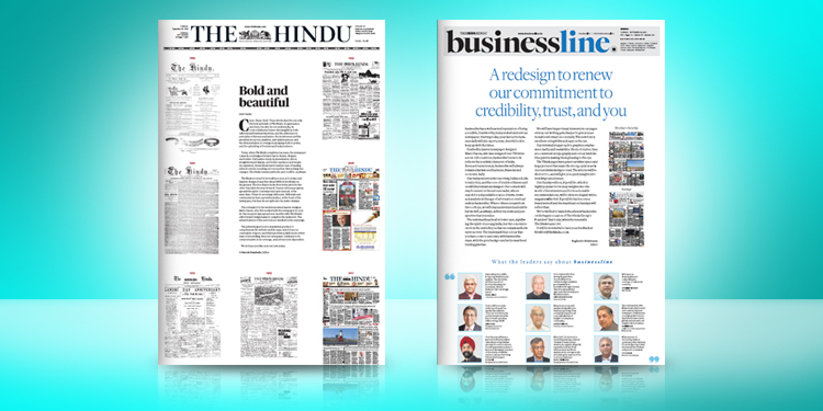
The Hindu and businessline donned a new look recently. Medanews4u.com reached out to art and design experts from the world of branding for their take on the new design.
Rubecon’s Alexander Zachariah, Landor and Fitch’s Arnab Ray, W+K’s Santosh Padhi and Nihilent’s KV Sridhar weighed.
While three of our reviewers give the new design an overwhelming thumbs up, one of them says more could have been done. Read on.
‘A good step forward while retaining the depth and elegance’
– Alexander Zachariah , Creative Director, Rubecon

The revamped design of The Hindu is sharp and effective and really works on two counts:
First, it is visually cleaner and more breathable with the bolder typefaces, larger pictures and enhanced whitespace making for a more effortless reading experience.
Secondly, it is a clear move to be effective in the digital era. The short, highlight reads along with the QR codes and digital links clearly cater to the new digital generation and the impatient reader of today. This is a welcome addition to the traditional newspaper format.
Overall it looks like a good step forward while retaining the depth and elegance associated with The Hindu.
On the businessline, I like the use of lowercase type on the masthead. It makes it friendly, easy to read and approachable. The bolder lowercase font also has more visual throw and readability. Its layout is far more airy. Information in the form of text is made more interesting with smart graphics. The use of blue as a house colour brings relief and builds a strong identity . Also overall the grid is used very creatively by the use of double and single column widths in the setting. The whole design looks very smart and elegant.
‘Fabulous work of creating hierarchy of weightages’
– KV Sridhar (Pops), Global Chief Creative Officer, Nihilent

It is a very good design. Typography grammar always says stick to one font in different ways. Earlier, The Hindu used both Sans-Serif and Serif – two different fonts in the headline. There was no identity as such between the week day edition, weekend edition, and businessline, and all the specials they ran. This time the design has done a fabulous work of creating the hierarchy of weightages including a bit of italics thrown in.
The nomenclature, lots of features in different sections have also been managed with the typography well.
Markers are also dealt very nicely and contemporarily. Even if you were to see the trademark of The Hindu (between The and Hindu), earlier it used to be much thicker, now they made it more contemporary and much more thinner, thereby reducing the weight. The size is the same, but the weight gets reduced because it is made thinner. Therefore, ‘The Hindu’ will stand out far more than before.
‘Could have been slightly edgier, braver, and bolder’
– Santhosh Padhi, Chief Creative Officer, Wieden + Kennedy
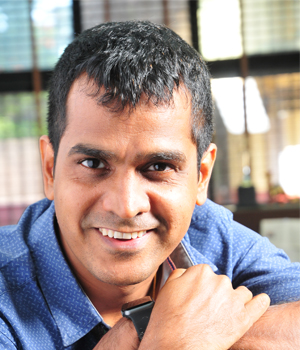
I believe that change is always wonderful, especially for brands and people who are catering to a larger audience. I am glad that The Hindu decided to change the design. There is always an issue on what amount of change is the right change. I feel that they didn’t want to bypass or ignore the current audience, hence, only minimal changes have been made in terms of layout of the newspaper design.
But, given a chance, I would have changed a little more, into a little more younger and vibrant design. Let us not forget that we are living in a visual world, where the look and feel matters a lot. If they wanted to get a younger audience on their side, they should have done the design with little more relevance – it demands a slightly edgier, braver, and bolder design. Their stories are far more brave and courageous – I wish that had been translated into the visual language in the layout as well.
‘Nice gravitas while making it contemporary’
– Arnab Ray, Creative Director, Landor & Fitch

When I compared The Hindu’s news design with the earlier one, I felt that the current design has international quality to it. Whether it is in terms of choice of fonts, the consistency in the usage of fonts, and even in small details like the usage of quotations.
The Hindu being a legacy publication, the design has a blend of legacy meets modernity, there is a nice gravitas to the newspaper while making it contemporary.
At a time when people consume content on digital media platforms, it is imperative to attract the people to the publication. The design has utilised the space under the masthead in an interesting way.
Overall, the new design gives the newspaper a nice aesthetic. The information is organised well which helps the readers navigate through the pages easily.

