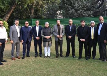
Mumbai based Sharpener Design Studio, helmed by Hetal Ajmera and Bianca D’Sa, has created the ABP group’s centennial milestone campaign.
The logo of the centenary campaign unveiled is an interpretation of the concept that ‘Curiosity makes everything interesting’. Profoundly connected with the brand philosophy, the most striking visual element of ABP Group’s novel logo is its question mark motif, etched as a human face in reverse – a face that keeps changing with depictions. The idea of using reverse or negative space within ABP’s centenary symbol captures the essence of human progress which not just breathes to live but is curious to question.
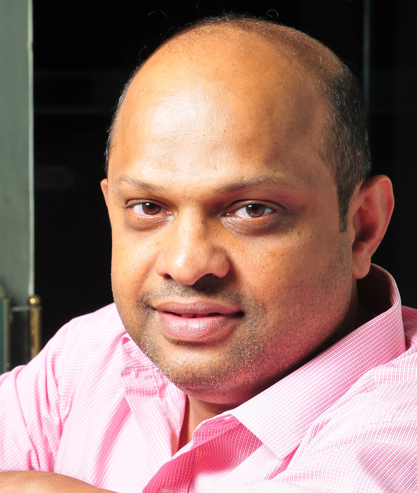
“Not being part of a large agency network anymore, I knew I needed serious help when the idea started incubating inside my head. When Sharpener came on board, I was relieved as I have worked with the team before and knew they punched well above their weight in visual and graphic thinking. The bold, affirmative, precise and sharp undertones that the mother brand ABP emits in this campaign is largely due to the mature and evolved handling of the tone of voice through the look and feel. It’s easy to say let’s celebrate the sense of curiosity through the question mark but to bring it alive in a clean graphic symbol of the human face inside a punctuation is a remarkable manifestation of the design power that the Sharpener team brings to the table.” said Agnello Dias, creator of the campaign.
“With a great brand comes triple the responsibility. You have to keep your creativity in check and yet let it flow. Finding that sweet spot to balance out a thought process is where the challenge comes in. That said, Aggy was a wonderwall as always and we are, both, grateful and pleased as punch to have had the honour” said Echo Hetal and Bianca, Founders, Sharpener Design Studio.
Credits:
Creative Team:
- Agnello Dias
- Lata Vasudevan Bagchi and Hetal Ajmera of Sharpener Design Studio

