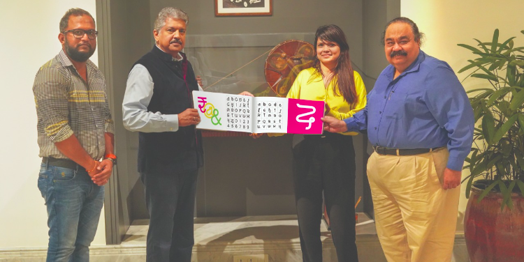
Mumbai: Rediffusion’s sister agency Everest has unveiled a commemorative font to celebrate 75 Years of Everest which coincide with 75 Years of Indian Independence.
Over the last six months, a team of India’s top typographers at Everest and Rediffusion Design Studios, led by Virendra Tivrekar, created a commemorative font that would intrinsically and eternally be Indian. The font, appropriately called BHARAT, was launched in Mumbai over the Independence Day weekend by Mahindra Group chairman, Anand Mahindra in the presence of Dr. Sandeep Goyal, Managing Director of Rediffusion and Kalyani Srivastava, its Joint President.
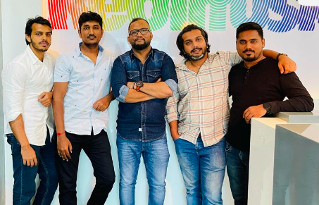
BHARAT font is the labour of love of a closely knitted team of five designers: Virendra Tivrekar, Ajit Rakhade, Rohan Parab, Arif Khan and Akash Sharma who have researched, ideated, planned, executed and beautified the font. “We looked at all the letters of the alphabet in all the Indian languages to draw inspiration and figure out which of these we could adapt, reshape and redesign into a uniquely different font that would coalesce the goodness of India’s diversity into a visual unity,” says Virender Tivrekar, Executive Creative Director, Rediffusion Studios, who is a JJ School alumnus, and has a specialization in typography.
Dr. Sandeep Goyal, Managing Director of both Rediffusion & Everest explains further, “Happily for us, the 75 years of Everest coincided with the 75 years of independence of our great nation, India. The agency team set its heart on designing a befitting tribute to India that would have utility and memorability beyond just a date. Hence was born the idea of the Bharat font that would epitomize the spirit of India. It was not till 2010 that India got itself a symbol for the rupee currency. So having a font that is nationalistic and invokes pride by its usage is the driving force behind the creation of BHARAT”.
According to the statement issued by Rediffusion stated that Bharat, interestingly, has a strong phonetic underpin. Every letter of the alphabet is rooted in the letter’s phonetic sound in the parent Indian language – be it Odia, Tamil, Telugu, Devnagari, Gurmukhi, Kannada and more. For example the ‘Q’ is a combination of half a ‘ka’ and ‘va’ of Hindi, and rendered accordingly.
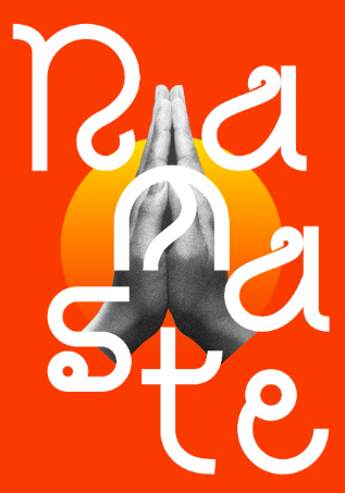
Bharat has been tested with consumer groups on easy readability. After initial exposure, there were no reading or usage issues. Initially, the font will have to be downloaded from a digital link, but can subsequently be used on both computers and mobiles without any difficulty, added the statement.
By the way does any country in the world have a font of its own? The answer is yes – just one, Sweden. Sweden Sans was created in 2014 by Stockholm agency Söderhavet which designed a modern geometric typeface inspired by 1950s signs to be used by the government and by business corporations. Well, India too now has its own font: Bharat. And, why not?
Countries have national anthems, national dishes, national animals, national birds, even national dances … well it is time to celebrate a national font.

