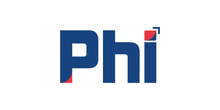
Mumbai: Phi Commerce, India’s unified payment platform, has unveiled a new logo created by Pune-based agency Chameleo, part of the Jet Synthesys group. The logo reflects Phi Commerce’s values and global vision.
Phi Commerce draws inspiration from “PHI,” symbolizing perfection and harmony through the golden ratio and Fibonacci curve, reflecting its commitment to offering flawless payment solutions.
Key Features of the New Logo:
Fibonacci Curve: The logo showcases a Fibonacci curve, embodying the Organization’s commitment to perfection and harmony. This is evident in the “P” and “i” design elements, which represent the golden ratio, symbolizing balance and perfection.
Colour Scheme: A vibrant mix of blue and red signifies growth and dynamism. Blue stands for stability and trust, while red embodies energy and passion, highlighting Phi Commerce’s relentless drive to thrive globally.
Arrow Over ‘i’: The arrow over the “i” in Phi signifies growth, highlighting the organisation’s progressive approach and upward trajectory in the payments industry. This element represents forward-thinking and ambitious goals as they expand their reach.
Global Unity: The overall design represents Phi Commerce’s mission to unify payments across the world, bridging gaps and facilitating seamless transactions globally. It illustrates the company’s commitment to connecting diverse markets and simplifying global commerce.
Jose Thattil, CEO of Phi Commerce said, “Our new logo is more than just a visual update; it’s a representation of our journey and our future. As we expand internationally, it’s crucial that our brand reflects our values of perfection, growth, and unity. The new design captures the essence of who we are and where we are headed.”
Phi Commerce’s new logo reflects its commitment to excellence and global payment unification as the company grows and evolves.


