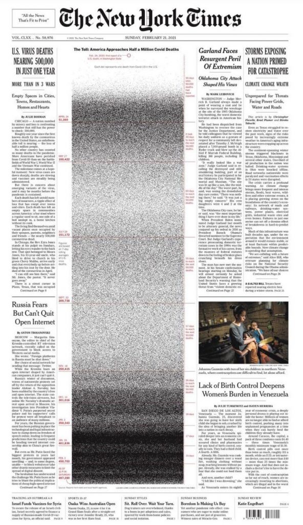
The half of the front page of Sunday’s New York Times was dedicated to the graphic, which had nearly a half-million dots running down the page’s length and across three of its six columns. Each dot represents a single life lost in the United States to the pandemic.
Previously also the page has been used to visualise the depth of the global pandemic. When Covid deaths in the United States reached 100,000 last May, the page was filled with names of people lost to COVID-19. When the number reached 200,000, the lead photograph on the page showed the yard of an artist in Texas, who filled his lawn with a small flag for every life lost to the virus in his state.

In late January, the New York Times published a graphic version when the Covid-19 deaths hit 425,000 after four of the deadliest weeks of the pandemic in the United States.
According to the New York Times report, which quoted Bill Marsh, a print graphics coordinator who helped oversee the execution- the digital concept worked equally well in print.
“We can create something with half a million dots that are visible and readable all in one piece, on one sheet of paper, that people can scan and ponder — it’s made for print, in a way. It seems natural for the front page.”


