From assisting in the development of the GSM (Global System for Mobile communication), 3G, and LTE standards, Nokia has made notable contributions to the mobile telephony industry across the globe. From a consumer standpoint, circa late ’90s, Nokia was the largest mobile phone and smartphone manufacturer and vendor, for over a decade. With the advent of other mobile phone brands and owing to several reasons including reported bad management decisions, Nokia’s share in the mobile handset market dropped drastically.
In 2014, the mobile phone business was bought by Microsoft. Post the acquisition, Nokia began to concentrate on its telecommunications infrastructure business and on Internet of things technologies. In 2016, the brand made a comeback to the mobile and smartphone market. It sells mobile handsets, laptops, tablets and accessories under the Nokia brand even today but has ceded space to the competition.
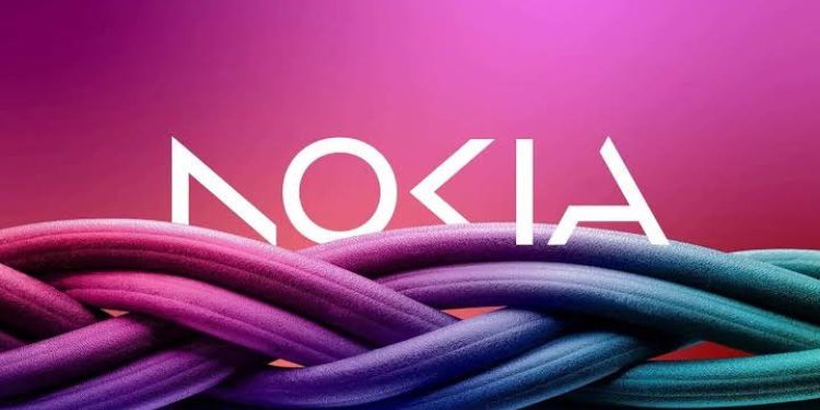
The brand has announced a change to its iconic blue logo for the first time in 60 years. Nokia CEO Pekka Lundmark said that Nokia is no longer just a smartphone company, but a “business technology company”.
Apart from growing its telecom equipment business, Nokia is also planning to focus on selling gear to other businesses, which include private 5G networks and equipment for automated factories.
The new brand logo comprises five different shapes forming the word Nokia. The question is: Can Nokia rise, will the new logo help?

“Nokia was the brand of one of my early and proud possessions when it was about ‘connecting people’ through their mobile phones. So, some residual fondness/ positive bias is still there though we saw how they lost the game first to Blackberry and then Apple,” reminisces Ashwini Deshpande, Co-founder & Director at Elephant Design.
She adds, “I understand they are a B2B technology company now. But they still sell devices that eventually help people use mobiles if I understand correctly. And after all, isn’t technology about making lives better? So, I would have hoped for a more humane interpretation in this rebranding exercise.”
Deshpande says that Nokia’s rebranding reminded her of the KIA rebranding that happened a couple of years ago: ‘Sharp, edgy, devoid of any human touch’.
According to her, adding color is an interesting thought that liberates the communication system to venture into a variety of messages.
“Specifically about the logotype, it is a good graphic design showcase with dynamic yet balanced forms that come together to make the alphabets. I would be keen to see how the brand story emerges through applications of logos online and offline,” she adds.

According to Mitrajit Bhattacharya, an independent consultant and specialist focused on luxury brands, Nokia’s logo change after 60 years has two parts.
“First, on the logo change, I like the new logo. It’s futuristic, fits well with the new positioning of a business technology company, as CEO Lundmark defines the shift in business strategy over the years. Also, colour as per use, instead of a fixed blue, stands for agility and flexibility,” he adds.
“Now onto the second part of the first change after 60 years, it baffles me how a company that has been struggling over the past two decades, that too in the fast changing technology space, is taking up a logo change after such a huge gap. Shows lethargy and lack of risk-taking ability. So, will it be better late than never or too little too late? Time will tell,” Bhattacharya observes.

Lloyd Mathias, Business Strategist and former marketing head of HP Asia, says that it is interesting that Nokia has changed its logo after decades. At the same time, Mathias believes that it will mean very little, until Nokia transforms its entire business model.
“The old Nokia has flipped various businesses several times. The phone business has gone across and moved on to a new company and what is left is the network business. I believe that at some level they want to erase the memory of the old Nokia and the fact that it was once an iconic brand in mobile phones. It is an interesting move to change the branding of the entire company. It is just one step and they need to do a lot more in terms of how they plan out things,” Mathias adds.
“The logo is cutting edge, clean and classy and will work very well on the digital format,” observes Sharad Haksar, CEO & ECD, 1pointsize.
He also believes that a logo change doesn’t change the brand and if the brand has to work, the company has to make products that work.
“These days the mobile phone market is dominated by brands like Apple and Samsung. As a PR for Nokia brand, it is a good move and is a great approach to mark that presence. I believe that alone is not going to work, they should introduce products which will do the talking,” Haksar concludes.

