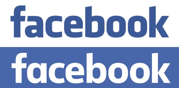
Facebook has quietly refreshed its brand logo with a number of minor changes to the typeface.
Although the brand’s leading ‘F’ icon remains unchanged, the fully-written Facebook logo has been updated. The Facebook logo changed with design developed in-house at the social network, was done with the help of Eric Olson of Process Type Foundry.
On the subtle changes, Brand New quotes Josh Higgins, Facebook creative director, as saying: “When Facebook’s logo was first created in 2005, the company was just getting started and we wanted the logo to feel grown up and to be taken seriously.
“Now that we are established, we set out to modernise the logo to make it feel more friendly and approachable. While we explored many directions, ultimately we decided that we only needed an update, and not a full redesign.”
Higgins concluded: “We worked with Eric Olsen – whose typeface Klavika was used in the original logo – and developed a custom typeface to reflect where we are now and where we are headed.”
Brands as widely visible as Facebook have to tread carefully when it comes to such endeavours, likely learning from the backlash Spotify recently endured after it slightly changed its logo to bring it thematically in-line with the app’s user interface.


