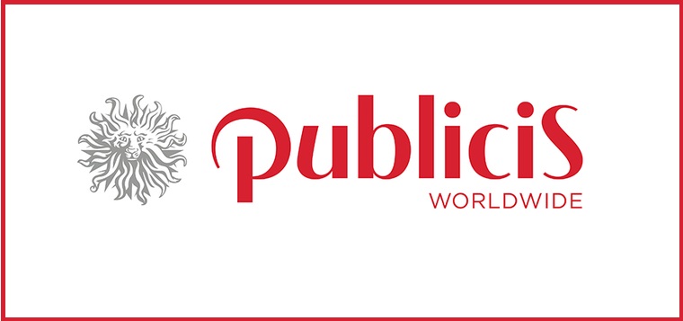
Publicis Worldwide has launched a new logo design in homage to the original Publicis logo created by founder Marcel Bleustein-Blanchet in 1926.
The new identity borrows the Art Deco style of the orginal sign that hung on Bleustein-Blanchet’s first office door, but also incorporates modern characteristics including symmetry and simplicity, while maintaining the iconic Lion head of Publicis Worldwide.
The refreshed design will see the network take a step in distinguishing its branding from that of the holding company, Publicis Groupe, headed up by Chairman and CEO Maurice Lévy.
Commenting on the launch, Arthur Sadoun, Global CEO of Publicis Worldwide, said: “In many ways the new design reflects our Publicis DNA and what we aim to do for every client we work with. And that is lead the change… Our intent was to create an ownable and timeless design.”
The new logo was conceived and developed by Publicis Worldwide North America. The typography is simple and the font style, Gotham, is a nod to modern. Publicis Worldwide’s legacy colour red remains dominant in the new branding, while introducing different gradients and complementary colours.
The new branding will be rolled out globally over the next month.


