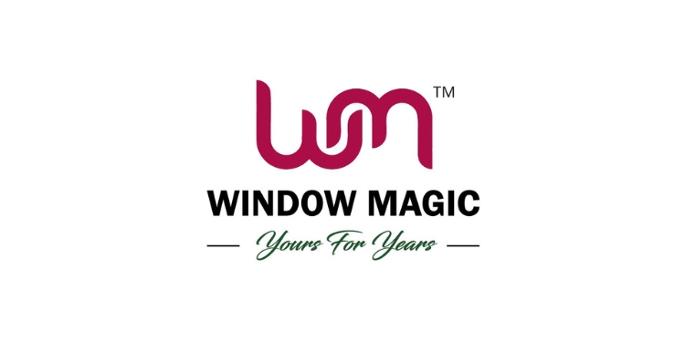
Mumbai: Window Magic, a fenestration brand and a player in Engineered uPVC and Aluminium Doors and Windows has unveiled its new logo. The new logo is a modern take on the brand’s heritage, looking to embody its commitment to innovation and design excellence. The decision to update the logo was driven by a desire to reflect the company’s growth and its dedication to modern design principles. The new logo captures the essence of Window Magic’s brand identity while incorporating contemporary aesthetics, ensuring that the company continues to resonate with both existing and new customers.
The introduction of the new logo is a strategic move to fast forward Window Magic’s brand imagery into the future, in synchrony with what Window Magic is doing.. It aims to capture the attention of customers and stakeholders alike, sparking renewed interest and engagement. This rebranding effort is part of a broader initiative to enhance the company’s presence and resonance in the marketplace. The revitalized logo is not only visually striking but also aligns with the latest trends in design and branding.
The redesigned logo features a sleek, contemporary look that aligns with current design trends, yet remains true to the brand’s longstanding reputation for quality and innovation. This update is part of a broader initiative to enhance Window Magic’s overall brand presence and better connect with its audience in a dynamic market.
“Upgrading our logo represents more than just a visual change. It signifies our ongoing evolution and commitment to staying at the forefront of the industry. The new design embraces modern aesthetics and reflects our core values and dedication to excellence Clarity and simplicity are at the heart of the new logo. We believe that a clear and clutter-free design communicates our brand’s message more effectively. Our goal was to create a logo that quickly and efficiently conveys the essence of who we are without unnecessary distraction. Incorporating a concise tagline within the new logo reinforces our core message and values, providing a concise reflection of what Window Magic stands for. This addition strengthens our brand identity and ensures that our mission is communicated clearly to all who encounter it” said Manish Bansal director, CEO Window Magic.
The most notable change in the new logo is the colour shift. The previous logo featured a pink hue that, while giving a feminine look, often appeared less impactful and sometimes even misleading with black tinges that could give an impression of a printing error on various media. In contrast, the new logo embraces a magenta colour. This bold and contemporary shade is designed to enhance visibility and make a striking impression, aligning with its modern brand ethos.
Additionally, the new logo incorporates a tagline Yours for Years which looks to underscore the dedication to crafting products that are both durable and reliable. This tagline seeks to reinforce the promise to deliver long-lasting value to customers and highlights the core principles that drive the company.
This update aims to represent more than just a cosmetic change; it symbolises the ongoing commitment to evolving and improving the brand experience. The new logo is designed to resonate more effectively with the audience and reflect the enduring values of quality and reliability explains the company.


