Mumbai: Ongo, one of India’s leading digital payments brands has unveiled a refreshingly new logo and a tagline ‘for everyone, everywhere. The new brand identity represents the bold and confident nature of Ongo, appealing to today’s modern digital-savvy Indian customers who are constantly on the go. Amidst an evolving digital payment landscape, Ongo’s new brand identity encompassing a brand re-positioning, new architecture, and visual identity reflects the ubiquitous role of payments in consumer lives.

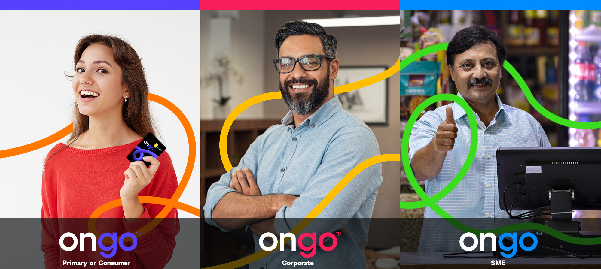
Designed byLandor&Fitch, a WPP creative agency, Ongo has a distinct visual identity marked by a different color palette each for Consumer, SME, and Corporate segments. The Primary or Consumer brand logo is represented in hues of Purple and Orange while the SME logo is designed in the hues of blue & green. For the Corporate brand segment, Ongo Logo uses colors of Plum and Yellow. The Ongo loop demonstrates the flow of money in a tangible manner across sectors & customers.

Speaking about the brand journey, Ravi B Goyal, Chairman & MD, AGS Transact Technologies Ltd. said, “We are constantly innovating to best suit consumer needs and industry demands through our digital payments brand Ongo. In today’s fast-paced digital world, customers seek smarter and safer solutions that offer convenience on-the-go. Ongo’s new brand identity complements this larger shift which is shaping the current digital payment ecosystem. As we continue to stay true to our overall commitment to democratizing transactions through innovation, in our next phase of growth we aim to offer more consumer-centric products such as open-loop cards and gift cards. We are confident, that Ongo’s distinct and refreshing new identity will resonate with individuals, SMEs, and Corporates, further reinforcing its tagline for everyone, everywhere.”
Mark D’Costa, Managing Director, Global Business Innovation Landor & Fitch said, “Ongo is an innovative payment solution in the market, so it was our duty to ensure customers see that as well. Through the updated brand platform, streamlined brand architecture, and the bold new visual identity, the end result is a reinvigorated brand that speaks to everyone, regardless of a corporate or an individual. Ongo will now carry itself with a new sense of empowerment, making it ready to create a positive difference to society by offering new levels of convenience, comfort, and security. We are immensely proud to be Ongo’s brand guardians.”
Ongo’s new logo will be seen across all customer touchpoints, products, websites, and various applications. Ongo’spayment touchpoints such as the POS terminals will be accompanied by a distinct sonic tune for all successful transactions.


