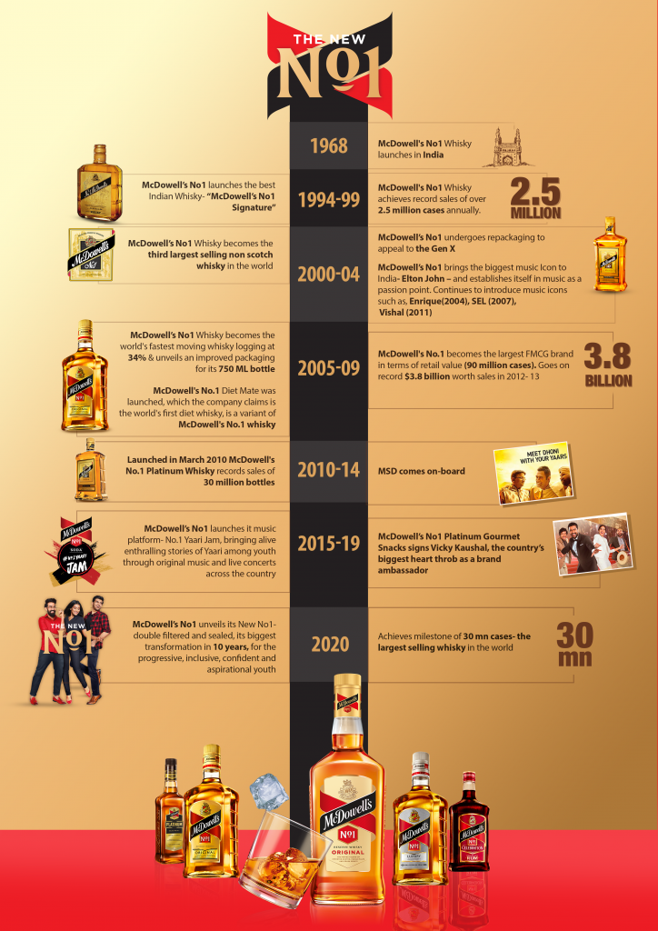
Bangalore: Whisky Brand McDowell’s No1 has announced a complete brand renovation that aims to make whisky a choice of drink for the next generation of enthusiasts. The new approach will incorporate a new logo unit, a better-balanced whisky and a sustainable packaging- The biggest change for the brand since its launch in 1968.
The new pack is aimed at modernizing the brand McDowell’s No1, positioning it as the country’s most iconic whisky, while giving the consumer an elevated experience. The pack design retains elements that are distinctively McDowell’s including the recognizable logo. The bottle will now sport a modern contemporary design that is slightly taller than the existing bottle, giving the bottle a premium look
The new McDowell’s No1- Original promises to bring a more balanced whisky experience with great aroma and feel, retaining the Original Taste. The McDowell’s No1- Luxury, the Smoothest No1, will offer a superior experience for its diverse consumer portfolio that includes young millennials, who often look at celebrating at home over fun conversations and more.
An essential part of the new logo design is the embrace – resembling the embrace/ hug when 3 or more friends/yaars meet – personifying the brand’s commitment to fostering friendships. The brand’s philosophy of friendship is beautifully engrained in an all new open embrace logo unit, also defining the ‘open to all culture’ of today.

Speaking on this refresh, Amarpreet Anand, EVP Marketing & Portfolio Head, Diageo India said, “McDowell’s No1 has been on a continuous journey since 1968 to bean enabler of friendships in all occasions. We are excited to bring to you- two distinct variants- The No1 Original which is better balanced and the No1 Luxury which is now the smoothest No1. With this new blend, bottle and packaging, we hope that this iconic brand will take a leap into a more contemporary and premium space. “The New McDowell’s No1is the whisky you already love”, and we look forward to our consumers choosing the Original, Luxury the next time they want to celebrate.”
The new campaign #TheNewNo1 & #ChangedWithYoupushes all the boundaries with its communications by becoming progressive, inclusive, confident, young and aspirational. The brand will look to explore an aggressive 360-degree communication strategy that builds on this new positioning. The brand will also for the first-time feature women in all its communications- offline & online.
Led by Design Bridge, the team behind the renovation of iconic brands such as Guinness, Smirnoff, Tanqueray, Gordon’s and The Singleton.The renovated McDowell’s No1 pack brings design codes that are subtle, yet significant in positioning the whisky as a more premium and youthful product.
Speaking about the design, Creative Director Jon Neal from Design Bridge said, “This renovation signals a complete transformation of the McDowell’s No1’s visual language. The brand identity was simplified and modernised for the next generation of drinkers, while maintaining the positive attributes that had built the brand’s success and credibility over the years. Within the retail space, the simplicity of the communication messages was combined with progressive key visuals and an impactful tiling of products on shelves. The result is a modern and aspirational aesthetics that brings a new brand experience to our consumers.”
The phased launch will see the refreshed pack on shelves across the country through the year.


