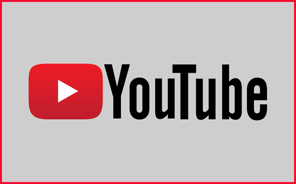
YouTube has revealed a new logo, along with some changes to its mobile and desktop formats. The new logo has rolled out on its mobile and desktop platforms, and will soon be implemented across YouTube’s other applications and services, according to a YouTube blog post.
Designed for user on multiple screens, the new YouTube logo combines a cleaned up version of the YouTube wordmark and Icon. This was to create a “more flexible design” which works better across a variety of devices, especially on smaller screens.
“When room is limited (say on a smartphone) you can use the brightened up Icon as an abbreviated Logo, which will be seen more easily and read more clearly,” the blog post read.
Meanwhile, the Google-owned platform also unveiled other changes to its design, namely on mobile and desktop platforms. According to YouTube, the mobile app now boasts a cleaner new design and the introduction of features such as videos which move with the user. This will allow users to jump between videos with a simple swipe of the hand. In addition, the YouTube player will also change shape to match the video format the user is viewing to improve the user experience.
A new desktop design is also available globally, and aims to be fresher, simpler and more intuitive in terms of user experience to “let content shine”. This includes a new dark theme which turns the background a darker shade while the user watches videos on the platform.


